Our logo is the result of the development of some key concepts:
Harmonization: Formed by a set of circles as a whole, and following the rules of simplicity, symmetry and order, proximity and closure, it makes us see a hexagon. This concept tries to convey an important idea: “the whole is greater than the sum of its parts”.
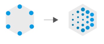
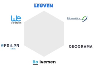
Hexagon: each of the corners of the hexagon represents each partner in the consortium who are involved in the development of the project.
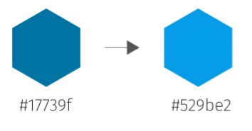
Color: Blue tones have always been closely linked to the technological and data world.
Movement: The degradation of colors, together with changes in the size of the circles, evokes movement, adaptation to changes, overcoming and future.
The result is a simple, recognizable logo that clearly expresses our goals!